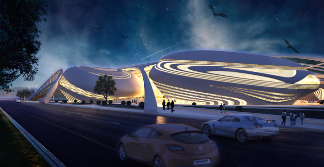
Design project Ying Yang public library by evgeny markachev + julia kozlova in korea / 1st prize winner.
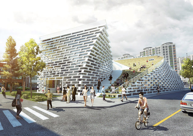
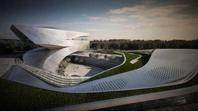
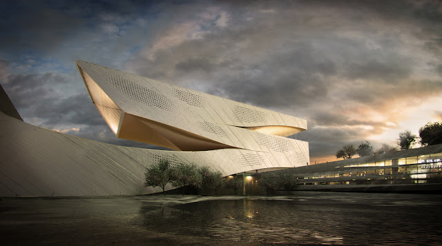
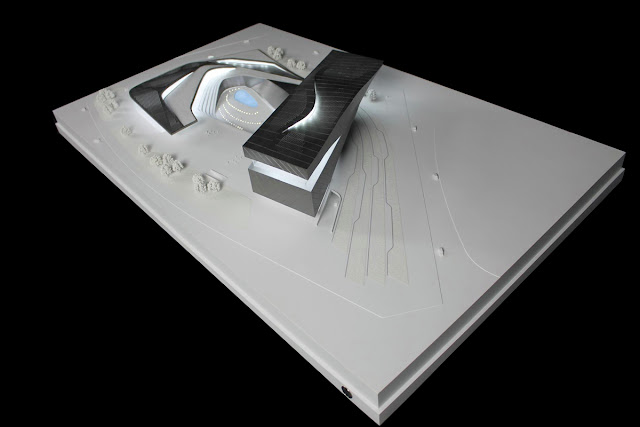
Developed by evgeny markachev + julia kozlova, the public library proposal implements the use of the philosophical ‘yin and yang’ sign as the form driver of the structure, symbolizing two different origins through interaction and complementarity.
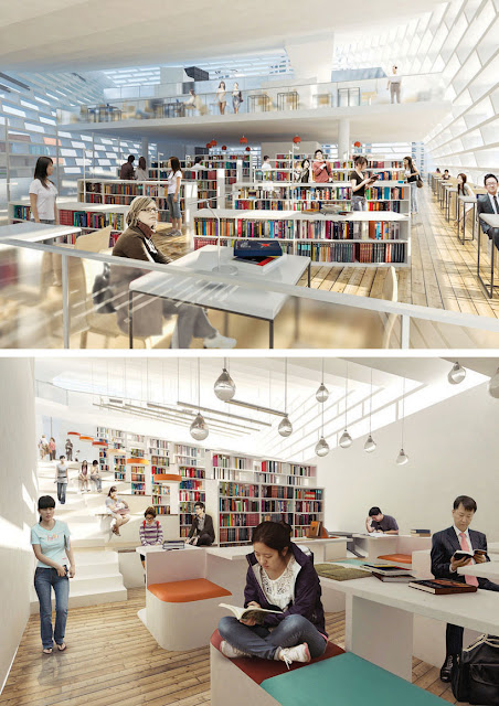
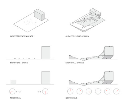
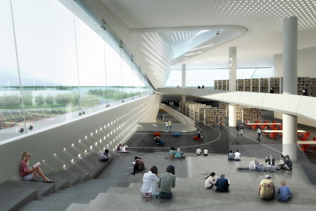
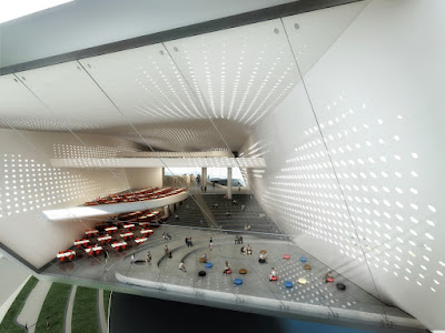
The concept obtains not only the shape of the motif, but also spatially divides the space into two opposite functional nodes that complement each other (education and communication).
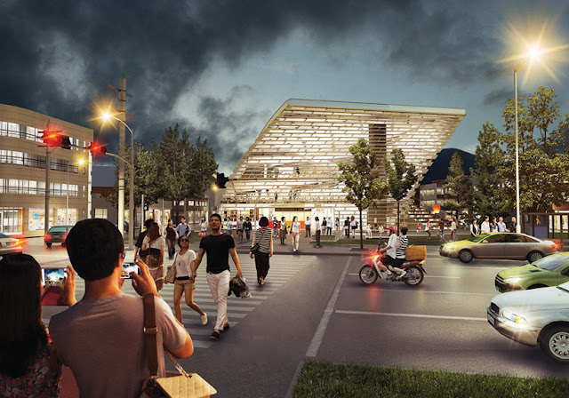
Due to the dynamic form the edifice is visually in constant movement, designating the other zones to be harmoniously distributed in the internal areas of the building.
This feature reflects the modern intensity and information interchange, dynamics of modern life.
The Project public library in Yin Yang won first place in the sustainable design category of the autodesk special prize in the archi-world academy awards for 2011-2013.
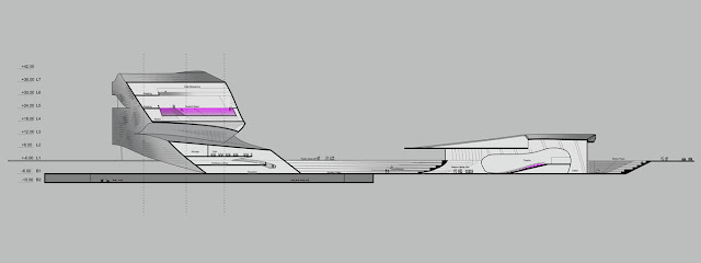
4. Two pans: The total volume of the building is divided into two parts by one of the main existing in this territory pedestrian routes.
5. Two functional nodes: The object has the appearance of the symbol and is divided Into two amphipathic by the meaning, but complementing each other functional nodes: -receipt of information -communication spaces
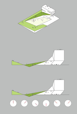
6. Lowered by one store: Half of the building is lowered by one store y to the level of the dwelling houses along which it is located _ This will provide the sufficient light conditions for the residential constructions and a more harmonious combination of the new building and of the existing one
7. Exploitable terraces The opposite faces of the both parts are lowered in order to create exploitable terraces on the roof that are accessible from the street.
8. Twisted both parts relatives to each other FoRowingthe concept design not only the internal line forms the contours of the 'Yin and Yang" symbol, the faces are turned with respect to the centre creating the constant movement of the volumes to each other. This completes the formation of the image solution _
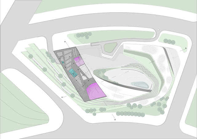
9. Green areas The terraces are planted; ascents to them are created along the building volumes. Both directions are intersected in the middle forming a common site. The territory in front of the facility is beautified (an area with a reservoir).
10. Entrance, exits, walking routes Each of the two functional parts has its own entrance. The main entrance from the square from the side of the main road. The upper storeys have exits to the terraces. A new walking direction is formed through the facility by the terraces that passes diagonally between the streets.
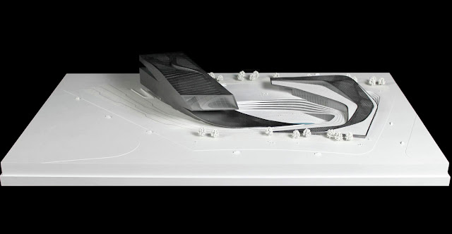
Architectural model of public library / Ying Yang won first place in the sustainable design.
Developed by evgeny markachev + julia kozlova, the public library proposal implements the use of the philosophical ‘yin and yang’ sign as the form driver of the structure, symbolizing two different origins through interaction and complementarity.
The concept obtains not only the shape of the motif, but also spatially divides the space into two opposite functional nodes that complement each other (education and communication).
Due to the dynamic form the edifice is visually in constant movement, designating the other zones to be harmoniously distributed in the internal areas of the building.
This feature reflects the modern intensity and information interchange, dynamics of modern life.
The Project public library in Yin Yang won first place in the sustainable design category of the autodesk special prize in the archi-world academy awards for 2011-2013.
1. The place: There is a residential area in the south-west, a church and public buildings in the east .
2. New boundaries of the site: The shift of the designed boundaries with a view to preserve the existing green zone and the distance bet on the residential area and the library
3. Number of storeys: Construction of the total volume of the 4-storeyed building in accordance with the project height restrictions4. Two pans: The total volume of the building is divided into two parts by one of the main existing in this territory pedestrian routes.
5. Two functional nodes: The object has the appearance of the symbol and is divided Into two amphipathic by the meaning, but complementing each other functional nodes: -receipt of information -communication spaces
6. Lowered by one store: Half of the building is lowered by one store y to the level of the dwelling houses along which it is located _ This will provide the sufficient light conditions for the residential constructions and a more harmonious combination of the new building and of the existing one
7. Exploitable terraces The opposite faces of the both parts are lowered in order to create exploitable terraces on the roof that are accessible from the street.
8. Twisted both parts relatives to each other FoRowingthe concept design not only the internal line forms the contours of the 'Yin and Yang" symbol, the faces are turned with respect to the centre creating the constant movement of the volumes to each other. This completes the formation of the image solution _
9. Green areas The terraces are planted; ascents to them are created along the building volumes. Both directions are intersected in the middle forming a common site. The territory in front of the facility is beautified (an area with a reservoir).
10. Entrance, exits, walking routes Each of the two functional parts has its own entrance. The main entrance from the square from the side of the main road. The upper storeys have exits to the terraces. A new walking direction is formed through the facility by the terraces that passes diagonally between the streets.
Architectural model of public library / Ying Yang won first place in the sustainable design.


